
[Originally published as How Preconceptions Influence Science]
In its Climate Change 2014 Synthesis Report Summary for Policymakers, the Intergovernmental Panel on Climate Change (IPCC) stated:
It is extremely likely that more than half of the observed increase in global average surface temperature from 1951 to 2010 was caused by the anthropogenic increase in greenhouse gas concentrations and other anthropogenic forcings together. (p. 5, emphasis theirs)
Advertisement Below:
In other words, they state that more than half of the warming that has been observed since the mid-1900s has been caused by human activity. How did they arrive at this conclusion? The scientists involved attempted to determine the natural variation in global temperature that would have occurred without human influence, and they found that it accounted for less than half of the observed warming. Thus, human activities must be responsible for more than half.
The problem, of course, is how do you determine how much warming would have occurred without human activity?
The way the IPCC did it was to look at the natural variation that has occurred in the factors that are known to influence the temperature of the planet.
One of the biggest factors is how much energy the earth is getting from the sun, which is often called the total solar irradiance (TSI). Well, we have been measuring the TSI with satellites since 1979, and while each satellite comes up with a slightly different value (the reason for that is unknown), all of them agree on how it has varied since they began their measurements.
However, in order to properly understand the long-term effect of TSI, we need to go farther back in time than 1979. As a result, observations that should be affected by TSI are used to estimate what it was prior to 1979. These are called “proxies,” and their use is common among scientists who attempt to reconstruct various aspects of the past.
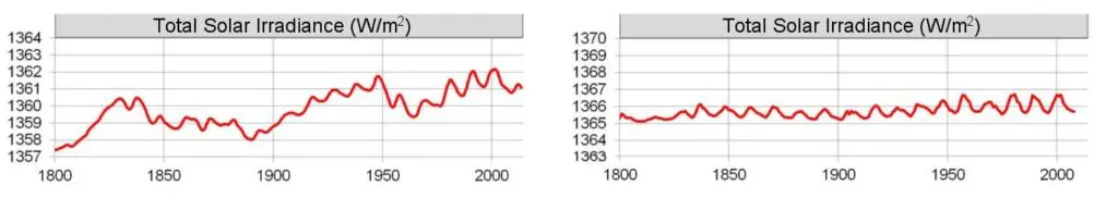
Unfortunately, it’s not clear what the best proxies are for TSI, so the details of how it has changed over time vary substantially from one study to another. That’s what I am attempting to illustrate in the figure above. It shows two different graphs for how TSI has changed since the year 1800.

Notice the one on the left (from this study) shows that TSI has been quite variable, while the one on the right (from this study) shows it hasn’t varied significantly over the same time period.
Both of these studies were published in the peer-reviewed literature, and both use accepted methods for reconstructing TSI from proxies. The difference, of course, is caused by the different preconceptions in each group of scientists.
Whose preconceptions are correct? We have no idea.
To demonstrate just how much variation occurs due to these preconceptions, here is a figure from a very interesting study that I somehow missed when it first came out (in 2015). It shows eight different reconstructions of TSI from eight different peer-reviewed studies:

I used the top two graphs to make the illustration that appears at the very top of the post. As you can see, the eight reconstructions are arranged so that the ones which show a high variability in TSI are on the left, and the ones which show a low variability are on the right. The “CMIP5” on the low-variability graphs indicates that these were the graphs used in the IPCC’s Climate Change 2014 Synthesis Report, which I quoted above.
Think about what this means
The IPCC specifically chose from the scientific literature TSI reconstructions that indicate there has been little variation since 1800. Thus, natural variation in TSI cannot explain much of the variation we see in global temperature. However, if they had used one of the reconstructions on the left, their conclusion would have been much different.
In fact, the authors of the study from which those eight graphs were taken showed that if you used the top left reconstruction, you could explain the vast majority of the variation we see in the earth’s temperature. Thus, had the IPCC chosen that reconstruction, their conclusion about the effect of human activities on global warming would have been radically different.

Hopefully, you can see what I am driving at
All eight of the reconstructions above are legitimate, peer-reviewed reconstructions of TSI. If you choose the ones on the right, you reach one conclusion about the extent to which human activities have affected global temperature. If you choose the ones on the left, you come to a completely different conclusion.
How do you choose?
You choose the ones you think are best.
In other words, you choose the ones that fit your preconceptions.
Unfortunately, this inconvenient fact is left out of most discussions of climate change. As a result, most people state what the “science” says, when they are utterly ignorant of how much that “science” depends on the preconceptions of the scientists who produced it.